
How To Get Your Paper Published At IMS – Part III
Part I of this column can be found here
Part II of this column can be found here.
Last time, I went over how to make life easy for the IMS reviewer so that we can increase the chances of getting a paper accepted. It is important to devote conscious effort to making it easy for the reviewer to give high scores in the originality, clarity, quantitative, and interest categories. In this column, I concentrate on the part that I feel is most important, quantitative. Note that all four parts are formally assigned equal weights when assigning scores and other reviewers might have different opinions, so this represents only my personal views on the matter.
First, we need to realize that the scores assigned to the papers are averaged over all half-dozen or so reviewers on a given subcommittee. These average scores are then usually used to sort the papers. We often start with the highest scores and accept most of the papers. It is always possible that one or more of the reviewers might see a problem that no one else caught (like double publication), and a high-scoring paper could be rejected. Later in the process, as we consider the lower-scoring papers, a larger percentage is rejected. Finally, most of the low-scoring papers are rejected. However, a reviewer might see value in a paper that was missed by the other reviewers. If that reviewer can persuade the others on the subcommittee, even a low-scoring paper can be accepted. Decisions are almost always made by consensus.
What this comes down to is that the paper score does not absolutely or completely determine whether a paper is accepted. Also considered is how the reviewers as a group subjectively feel about a paper. Recognizing this subjective component, whether we like it or not, is critical to improving our chances. Like Coke using a red can, what can we do to improve the “feel” of our paper?
One area is in the data that you present. A critical figure in most papers shows the final measured versus calculated results. One way to improve the feel is to use a good graphics program to create the plot. Except for PowerPoint slides, I have given up on the plotting options in Word and Excel. We get a bitmapped graph from those tools and they can look grainy in a full-resolution publication.
I use Adobe Illustrator, which is based on vector graphics. It has a nice spreadsheet-like graphing option. I copy and paste data from my spreadsheet into Illustrator and it creates the plot. The plot is not quite what I like, so I use the graphics elements created by Illustrator (like the axes, labels, and data curves) to make the plot just what I want. Illustrator is a bit expensive, but there are free alternatives. Search for “Adobe Illustrator free equivalent” and you will find a number of options. If you find one that works really well, tell others about it, too.
Because Illustrator generates vector graphics, you can rasterize the graph for screen resolution (72 dpi) for a Web page or a PowerPoint slide. For your submission to IMS, scale all black and white graphs to 3.25 inches wide and rasterize to 600 dpi and one bit per pixel or greyscale at 300 dpi. If you use color, stay with 300 dpi. Save your file in “tif” format. IEEE guidelines say to save a file with no compression, but those files get big. I have never encountered problems with saving LZW-compressed tiff files. LZW is “lossless,” which, unlike jpg, introduces no compression artifacts. Every pixel in the re-constituted image is returned exactly as it was in the original. I usually use black and white because it is printed at higher resolution, and I have no worry about information being lost when my reader prints it out in black and white. Always use a font without serifs (i.e., “sans serif”) on graphs, like Myriad or Arial. For short bits of text, such fonts are much easier to read.
Most published graphs include a table listing data markers to identify curves. Frankly, this is a real pain. I have to look at the table, figure out the tiny data markers for the several curves I want to evaluate, then look at the curves and figure out which ones have the desired data markers. If the data markers are too small or they are covering each other up, it rapidly becomes hopeless. The reviewer has very little time. You want the reviewer spending time enjoying the merits of your work, not getting out a magnifying lens to decipher your curve labels. I prefer to label the curves themselves. If it gets a bit crowded, arrows can help quickly identify which curve goes with which label. If the graph is too cluttered to clearly label each curve (or each group), split it into two figures. Figure 1 is a nice example saved at screen resolution for the Web.
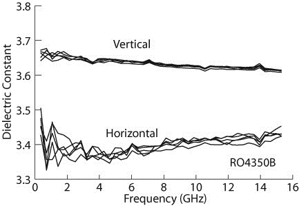
Figure 1: A typical data plot, from [1]. Plots like this make the reviewer’s job (and the eventual reader’s job) much easier.
I have noticed lately a number of papers with really, really good measured versus calculated results. I mean really good. Of course, electromagnetic software is so fantastic these days, we can’t help but get agreement that good. Or is it actually too good to be true?
Should we trust the author, or should we be skeptical? Remember, “In God we trust,” the motto on the U.S. dollar bill? These authors are not God, they are human. We are engineers. It is our job to be skeptical. But we would like something more than just a feeling when we think something is wrong. When we see a good measured versus calculated, we should be skeptical and look for specifics.
For example, try to see where the noise floor is in the data. You can start seeing noise on most measurements at about 40 or 50 dB down. Perfectly noise-free measured results down to 85 dB is very strange. Time to be skeptical.
Reflection coefficient in the passband of a narrow-band filter is notoriously hard to get right. One reason can be because VNA (vector network analyzer) calibration algorithms assume a characteristic impedance for a calibration standard in order to set the exact center of the Smith chart. In reality, the characteristic impedance is likely to be slightly different from what is assumed, and it is also complex. Is the reflection coefficient agreement in the passband region of a filter really good? Is it too good? That is a judgment call. Another thing to check is insertion loss. Add the magnitudes squared of S11 and S21. Does the result seem reasonable?
Do the differences between measured and calculated results correspond to manufacturing tolerances? Dielectric constant and circuit dimensions are uncertain, conductor cross-sections are not rectangular, metal thickness is important. A filter that is only a couple millimeters on a side fabricated in multilayer LTCC with lots of critical vias is very impressive, but agreement between measured and calculated that would require manufacturing tolerances of less than a few percent is unlikely.
Is the circuit on a printed circuit board substrate? Was dielectric anisotropy included in the EM analysis? Nearly all composite PCB materials are anisotropic (see figure 1). How about the surface roughness of the foil? Both roughness and anisotropy can change the effective dielectric constant by up to 15%. Was the substrate dielectric constant that is listed at the top of the specification sheet used? Look at the fine print in the material specification footnotes. A different dielectric constant might be recommended for design. Metal foil thickness can be important, too. If the EM analysis included none of these effects, but we still see incredibly good agreement, skepticism is warranted.
Are the data points uniformly spaced in frequency? If not, one must wonder if we are making our conclusions based on carefully selected data. Was data that did not look so good carefully removed from the presented data set?
Our best defense against faked data is an audience with a good healthy skepticism, willing to do reality checks and raise questions.
We certainly are not going to put on our police hats and start knocking down doors to catch evil-doers. It would be pointless. If authors are fabricating “measured” results, in most cases, it only detracts from the reviewer’s “feel” for the paper. In fact, most papers are not dependent on having super-good agreement between measured and calculated. Reasonable agreement is just fine, especially when there are so many complicating factors (some of which are described above) that prevent achieving perfect agreement. Plot real data. If you really do have incredibly good agreement between measured and calculated, it would be best to add a few words explaining how you achieved these fantastic results. Give the reviewers and readers a chance to believe you.
I hope you find my suggestions helpful in writing your next IMS paper. But of course, there are no promises of success. If it doesn’t work out, keep trying. Drawing an analogy to American baseball, stride confidently up to the plate and swing that bat as hard and as accurately as you can. You will still very possibly strike out. But don’t get mad and abandon the game. Get advice from the experienced pros on our team. Try again when your next turn at bat comes up. Swing hard. Swing with heart. Keep your eye on that ball. If you keep trying, you will hit a home run, there is absolutely no doubt. And when you do hit that home run, stop me next time you see me at IMS and let me know it worked. Good luck, my friend.
Reference
[1] J. C. Rautio, R. L. Carlson, B. J. Rautio, and S. Arvas, “Shielded Dual Mode Microstrip Resonator Measurement of Uniaxial Anisotropy,” IEEE Trans. Microw. Theory Tech., vol. MTT-59, no. 3, pp. 748–754, Mar. 2011.